LOGO DESIGN
Task
Development of a new brand logo including the claim and visualisation of the new brand strategy.
Wan Kwai's new brand identity is now aimed primarily at a younger target group and is intended to make cooking and trying out new things fun again.
Background
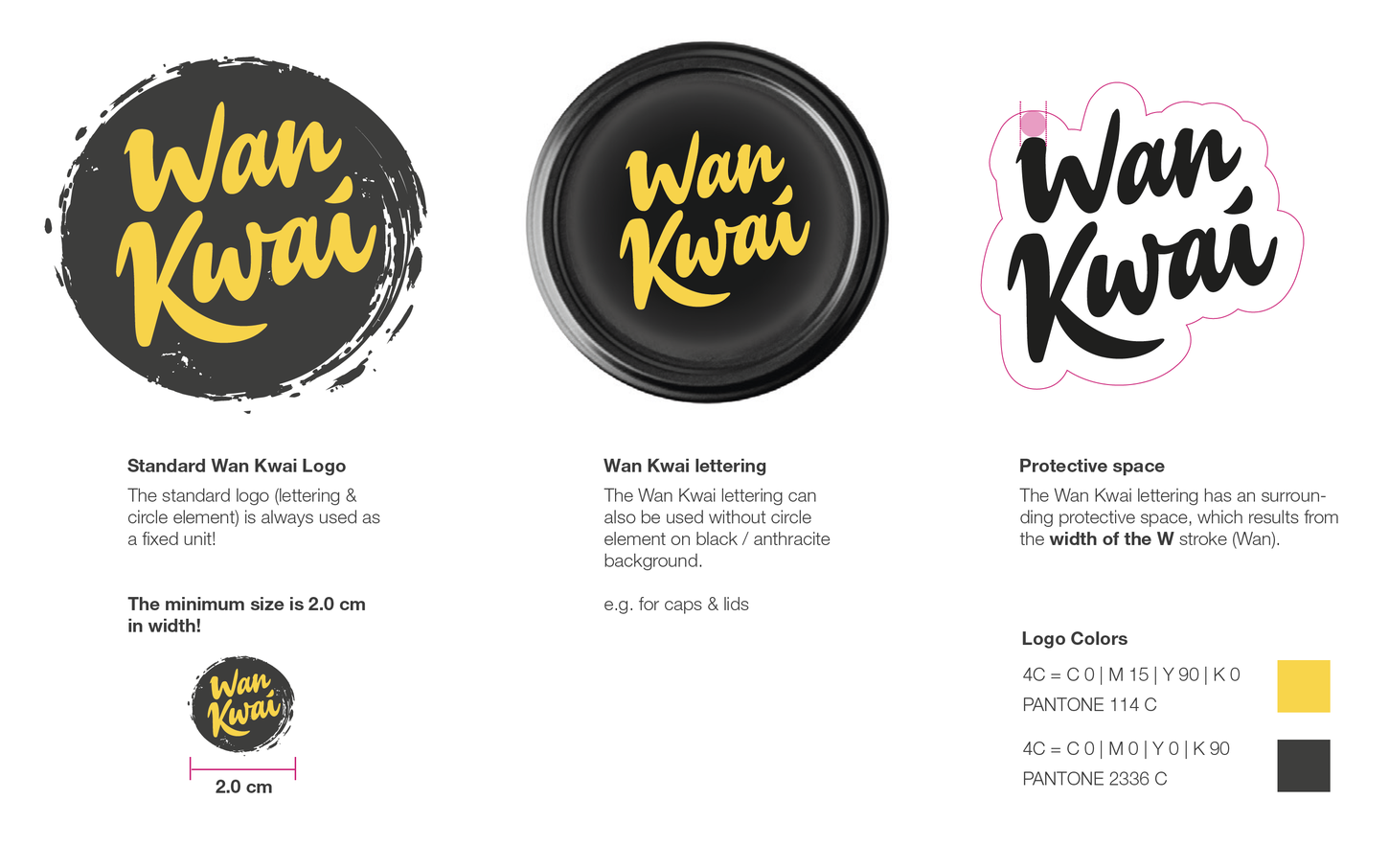
A deep, anthracite-coloured circle with rough, brushstroke-like edges refers to the traditional Chinese art of calligraphy. The bright sunny yellow colour of the brand name forms a strong contrast to the background and stands for the Asian sun - a source of energy and joie de vivre. The brand name itself, clear and unmistakable, reflects the authenticity of our products and invites you to embark on a culinary journey with us. The new logo embodies the harmonious symbiosis between tradition and modernity, between craftsmanship and new flavours. It is an invitation to discover the flavours of Asia and be inspired by its diversity.